Posts Tagged ‘advertising’

The previously shocking phenomenon of men wearing perfume, has become mundane in its ubiquity by now. And men looking pretty in perfume ads is not exactly rare either. So the latest Dior Homme ad starring Twilight heart throb Robert Pattinson almost passed me by. The fact I noticed it enough to stop and think about what it is selling, (apart from top notes of lavendar, sage and bergamot), is mainly due to the fab Led Zeppelin track accompanying the images.

The advert, shown above in its uncensored ‘directors cut’ form, expresses something else commonplace, but probably still worth commenting on: metrosexual machismo. The fragance itself might be screaming ‘IM STILL STRAIGHT’ despite the way it has made the lovely Mr Pattinson sensuous, coquettish, even passive (in this version of the ad, his girl straddles him in bed, and then he’s seen lying back looking all come to bed eyes into the camera). Metrosexuality may have gone mainstream quite a few years ago now, but it’s still not quite out.

Some of the motifs of this advert are positively 1970s in their macho symbolism – the beautiful girl on Robert’s arm reassuring us he’s not, you know… the car he drives down the beach in full on phallic pacifier mode, the red-blooded rock n roll Led Zep track. They all try and comfort the audience, and the man in the street about to indulge himself in some Dior Homme, that men’s self love is not gay. The (post coital?) cigarettes in the (ahem) uncut version of the ad didn’t make it to television,  being just too 1970s and against 21st c health and safety guidelines. And, inspite of the ‘uncensored’ tag, the film as a whole is very safe.

Of course wearing perfume doesn’t make you gay, but it doesn’t keep you straight, either. And I for one would like to see a few more media representations of metrosexuality that celebrate its sexual ambiguity. That is what I love most about it after all.

 

This week I’ve seen two videos that ‘turn the tables’ on gender roles, and specifically in the realm of ‘street harassment’ of women by men, the brutes. One (above) is an advert for Snickers, the other an Everyday Sexism project featured in The Guardian

The snickers ad has generated some commentary, including two posts with differing viewpoints in Sociological Images and a not very complimentary piece in Time Magazine.

I was going to write something myself but realised I don’t have much to say about either, really. I actually found them hard to watch, cringeworthy and annoying, especially the Everyday Sexism one. I think what’s most irritating about both is their heavy-handed use of ‘irony’ or what passes for it in our oh so knowing, clever-assed post-ironic world. Perhaps the Everyday Sexism/graun effort seems particularly crass because suddenly, feminists are using ‘humour’ to cover a topic they have previously had zero sense of humour about. My pal Ben who first showed me the Everyday Sexism vid had his comments about it deleted at Graun/Cif HQ, along with those by some other commenters. Maybe that ‘humour’ doesn’t run very deep then?

What do you think of these videos? Do they ‘turn the tables’ on gender norms or do they spectacularly miss the point?


Freud might have a field day with this ‘Man Extreme’  ad. The (phallic?) snake, eagle and lion are asking to be interpreted more than I have time for here. And anyway I am a bit preoccupied with the name of this gentle perfume: Man Extreme is a bit, well, extreme for something so fragrant. It’s ok, fellas, you can smell like lavender and patchouli if you want. That doesn’t make you a girl. Or does it?
 
Metrosexuality seems to be so blatant, so ‘out’, so obviously ‘feminine’ in many ways – those tits! those legs! that make up! that hair! – that it is no wonder many men, whatever their sexual identity, are a little bit anxious about giving in to something that seriously puts their ‘traditional masculinity’ into question. Before we blame straight men for this macho reaction to the explosion of men’s beautiful self-love, let’s not forget that the ‘gay beard’ craze is just as uptight and macho as any heterosexual expression of ‘manly’ anxiety. Remember 2011’s popular beardy ‘gay movie’ Weekend? And don’t get me started on GayBros – ‘straight acting’ gays who make the 70s Clones look positively forward thinking!
 
weekend
 
Then there’s Ballet Boyz. On one hand, this bunch of pirouetting peacocks remind us how comfortable young men are these days with a) showing off their bodies, b) embracing their ‘feminine’ side, and c) showing off their bodies.
 
 
On the other hand, there’s some familiar ‘disavowal’ of full on feminine flamboyance going on.  There’s the obvious ‘manly strap on’ in the name – Ballet BOYZ, with an added hard man hip hop flavour. And there’s the slightly ‘laddish’ (No Homo) atmosphere of an all-men dance company, run by two men, that enables a (bearded!) Guardian journalist to say:
 
“[the company] doesn’t do ballet. Instead, it does 21st-century choreography with a muscular and occasionally dangerous edge.”
 
Phew!  that’s ok then!
 
It is within this rather ‘backs to the wall’  21st century context of pretty boy, pretty insecure masculinity that Dove for Men have launched a new shampoo. And in which a Brazilian ad for their metrotastic hair care product has caused heads to turn.
 
 
Dove has traditionally described itself as being For Women. So when they launched their Dove Men cosmetics and toiletries range they needed to set it apart from the girls’ stuff.  And they’ve come up with quite an ingenious way of doing so. Judging by the reactions on twitter and elsewhere, this ad is a hit. But why? The advert involves an office worker who is plagued by long luscious locks, a la Pantene for women, and is only rescued by a colleague telling him how Dove for Men can restore his masculinity. Critics have called it ‘confused‘, as it veers between taking the piss out of men wearing ‘feminine’ cosmetics and celebrating (and of course selling) that very idea. But I think the cleverness of this commercial lies in its willingness to embrace the confusion that many men experience when buying into consumerism and narcissism, but also worrying about whether or not they are ‘still a man’. So the machismo that Dove are obviously espousing and exploiting is also subtly put into question and sent up.  Does shampoo really make your hair grow long and shiny? Of course not. As this tweet shows, the silliness of the premise is part of the ad’s success:
 
And making a man enact the exaggerated, posing, overly ‘coquettish’ movements of a woman in a shampoo ad, a subtle but not-missed message is put across about how ridiculous and unrealistic this version of OTT femininity is, and how gendered marketing for the same products is kind of lame in 2013. But for many men (and maybe women too) watching, whilst they are laughing at the joke, they are also reassured by it. Dove for men is a real brand, selling real shampoo to ‘real men’.
 
nivea
 
You’d think that maybe one group of people who are not convinced by these manly marketing strategies would be the ‘beauty bloggers’ and ‘male grooming’ bloggers who see these gimmicks day in and day out. But  the fact that consumer experts such as Grooming Guru are, despite a few misgivings, convinced by products labelled as ‘For Men’ shows how metrosexuality is still  somehow threatening, even to the most enthusiastic metrosexual men. GG says:
 

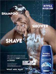
‘I’ve personally always found the ‘man’ prefix superfluous and silly (though I still think the “For Men” tag has value for brands like Nivea, Clinique and L’Oreal who need to differentiate their men’s lines (often reformulated to suit men’s skin and its unique needs) from women’s. So come on guys, don’t spoil your perfectly good products with thoroughly daft names okay?’

Pushing products ‘for men’ may of course in one sense be a wheeze to make more money – it creates two markets where once there was one – but I don’t think this is the whole story of Dove for Men, Or Man Extreme, or Ballet Boyz. Because the ‘market’ of men’s vanity and self-love (not to mention dance) has been growing and going strong for a long time now. I don’t think anything, not even – gasp! – gender neutral packaging would stop the tide of metrosexual consumerism.  But while that phenomenon is here, it may as well also do the job of soothing men’s troubled, but oh so moisturised brows, about their anxiety over what it means to be a ‘man’ in the modern age. Going back to Freud, I think that in the early part of the 20th century, he was exploring how the gender binary is a form of ‘neurosis’. Now, in the 21st century, I would like us to admit that as long as we split people into this arbitrary division between ‘men’ and ‘women’ and try and flatten out human complexity and the many many ways of expressing our identities, we will be stuck with silly, complicated but ultimately macho ads like the Dove for Men one.

The gender binary, unfortunately, seems to be a winning formula. But I’m not buying.

Transport for London may not be able to afford Olympic athletes for their ‘public service announcement’ campaign about the fast-approaching travel chaos that will affect the capital during the games. But many commercial companies and brands can. So this is the season of sporno-tastic olympic-themed advertising.

The above ad is for King of Shaves, a quite ‘low end’ razor brand which includes monthly rates for products delivered to your door on a regular basis. But its star model James Ellington, a sprinter, is not ‘low end’ at all. His torso and his tats are giving Becks and his relentless, profitable narcissistic display a run for his money that’s for sure!

But King of Shaves don’t actually mention the ‘Olympics’ in its adverts at all. This is most likely to be because London 2012 are working very hard at Protecting their Brand. There is even government legislation making it illegal to use certain phrases and words if you are not an official sponsor of The Games, such as British Airways.

I think though, that an athlete’s metrosexy body speaks for itself, and the difference in ‘quality’ and impact of ads around the Olympic theme does not seem to relate to language, but rather to imagery. Take these two adverts below, one for subway sandwiches the other for cadbury’s creme eggs.  Neither is very strong. But that’s not due to the lack of official Olympics Logo or terminology. I think it is due to the obvious absence of any tits or abs!

Whoever wins medals at the end of July/beginning of London, I know that metrosexuality will continue to be stood on the podium. In fact it has no competition!

h/t @grooming_guru for identifying James Ellington as the KoS model, and to @fennerpearson for the info on the protection of the Olympics brand.

If, as I do, you live in London, you will be forgiven for wondering if the Olympics haven’t already been and gone. They have certainly been flogged to death in the capital city over the last few months, even though they are still yet to start.

Londoners will also be aware that here, it is not necessarily Jessica Ennis’ fitness or Andy Murray’s groundstrokes that are on our mind. No, the big question on our lips is – ‘will the tubes be working?’

And, in its pseudo-helpful tannoy announcement kind of way, Transport for London is reassuring us that of course, the tubes will probably be f*cked during The Games, but don’t worry, here are some jaunty cartoons of muscly athletes to distract you. Look! A birdie! (oh no that is just the tfl twitter feed).

http://www.getaheadofthegames.com/

BUT, however grumpy I may be about the travel chaos that is about to descend on my city of residence, I actually quite like the TfL olympics ‘public service ads’. Why? Because they are metrotastic of course!

This one of the two hulking weight lifters trying to get off the tube is my favourite. Look at all that naked flesh! Those cute trendy trainers! The coordinated colourful outfits! Who cares if we are stuck for an hour on Finsbury Park station, if we get some international top class eye candy to keep us occupied?

Of course, athletic, muscle-bound men’s bodies on display for the viewer’s pleasure are not a new phenomenon. Back in the 70s and 80s Arnold Schwarzenneger was parading round in next to nothing, showing off his tits and pecs and abs for our delectation. Even The Guardian, in an otherwise body-phobic, misandrous, metro-bashing article about Magic Mike and men strippers, admitted that Arnie was a pin up:

‘It wasn’t until the 1980s that male stripping became a “thing”. Arnold Schwarzenegger had spent most of the 70s walking around in budgie smugglers, and Michael Ontkean went full chilly burlesque on the ice in Slap Shot, but it was only in the 80s that others caught up: a male performer serving up his penis on a tray to Tom Hanks in Bachelor Party, and Michael Keaton getting an eyeful in Mr Mom. ‘

And Transport for London also have a history of metrosexual display. They were one of the first metro companies to put adverts on the walls next to the escalators, and on tube trains,  so commuters can look at sexy stars instead of each other’s ugly mugs on the way home. I like this TfL Olympics poster that nods to that tradition:

However it IS a 21st century phenomenon that sports men now cash in on their desirability as a matter of course. The ubiquity of sporno means that sports stars are not just keen to win on the pitch, but also in the box office, on the billboards, on the telly.

And, my guess is that whilst Delicious David Beckham and Nubile Nadal would probably grab our attention much more effectively than these sketchy cartoons, Transport For London couldn’t afford their supermodelling rates.

Just as they can’t afford to improve their services to cope with the demands of the Olympics.

Nobody said the metrosexual era would be efficient though. So long as it looks good we’re all happy.

Right?

Sociological Images, the queens of criticising ‘women’s objectification’ in the media, have surpassed themselves this time. In a piece about ‘subliminal’ sexual messages in advertising they paint a picture of a world in which women are only ever presented as the recipients of men’s penetration and penetrative gaze.

In the above image they describe how the shadow of the perfume bottle is directed between the woman’s breasts. In the one below they ask, ‘where is the rocket going?’ (between the woman’s legs it seems).

And the text accompanying this beer advert reads:

‘This is a picture of an ad at the Burbank airport.  Notice the profoundly phallic shape of the foaming surf that happens to be pointing directly at the woman’s crotch.  The foam mimicks the crown printed at the top of the Budweiser bottle (in the upper left hand of the image in red).’

Well that really annoyed me, because if we are going to be reading things into the picture, surely it is obvious that the man is the one with his legs open wide, and the phallic-shaped  ‘surf’ is pointing towards him just as much as the woman? But no, Sociological Images only have eyes for women in the media, and men’s objectification of them.

My belief is that, in mediated imagery, men are the objects of the gaze just as much as women. There are ‘phallic’ symbols in a lot of sexual adverts, but they don’t necessarily represent men’s penetrative sexuality in relation to women. Using Mark Simpson’s theories, I have come to see these objects as ‘phallic pacifiers’, compensating for the ‘lack’ of virile masculinity that comes with passive poses such as these:

In relation to these sporno shots that Mark Simpson collected together he said:

‘It seems that words, in spite of everything, do still matter. And no one is more surprised than me. When I wrote about sporno for a catalogue accompanying an exhibition about sport and fashion my text was accepted by the editors – but when it came to the proof stage, higher-uppers got to see it and went ballistic.

I pointed out that the pictures I’d chosen as illustrations – which no one objected to – were MUCH more explicit than my textual innuendo, but to no avail.

And yes, the clutched rugby balls in these pictures are phallic pacifiers.’

In fact, in the photo including the rocket, rather than seeing it as going up into the woman, and penetrating her, it too, could be seen as a ‘phallic’ symbol for both the woman and the man, giving them some ‘power’ in a photo where otherwise they would both be passive objects of the gaze. The thing about analysing images is there are lots of different potential interpretations.

The subtitle of Sociological Images website is ‘seeing is believing’. But when it comes to men’s objectification, or ‘tartiness’ as Simpson calls it, these feminist academics are walking round with their eyes closed.

http://thesocietypages.org/socimages/2012/01/11/subliminal-sex-in-the-media/


I have made my debut at the wonderful website Science Of The Time, where I have written about Andre Pejic and a campaign advertising women’s lingerie:

What it is:
Andrej Pejic, if not quite yet a household name, is definitely well known as a beautiful androgynous model, and for modelling both men’s and women’s clothes. But his most recent campaign, for the Dutch chain HEMA (as Dutch as it can get), has got people talking again. Pejic is modelling push-up bra’s (add 2 cup sizes!) and other pieces of women’s clothing. In the popular British newspaper, The Mirror, Pejic’s agent Joseph Tenni was reported as saying:

 “It’s revolutionary. I’ve never known a man to do a womens’ lingerie campaign before”.

This shows two things: first that we are all getting used to the idea of a model crossing the border between ‘men’ and ‘women’, ‘masculine’ ‘feminine’ in these modern metrosexual times. But second, that a man modelling women’s underwear, is maybe one step beyond acceptable. It’s ‘revolutionary’.

Influenced by the work of Mark Simpson, father of metrosexuality (1994) and a keen trend watcher in the areas of fashion, advertising and men’s display of their bodies, I have commented about reactions towards Pejic before. I noticed that while journalists were prepared to call him ‘pretty’ or even a ‘beautiful boy’, they could not fully embrace the idea of male beauty and call Pejic what he is: a beautiful man.

Why It’s Cool:
Now the beautiful Pejic is wearing women’s lingerie and looking better in it than many women do. He is challenging our understanding of what makes a man (or a woman) altogether. The irony being that whilst we find it hard to imagine a man modelling women’s bras,  men’s tits are actually getting bigger every day and replacing women’s as a sign of ‘sexiness’.

We are living in what Simpson has called Transexy Times. And before long the ‘revolutionary’ and  very cool Pejic will probably seem normal to everyone.

Campaign by Doom & Dickson


Sociological Images have found a marketing campaign by a household decorating company, which aims to attract men to more ‘girly’ colours, by giving them ‘manly’ names.

So this ‘plum escape’ becomes ‘sucker punch’ and ‘bone white’ becomes ‘beer foam’. The saleswoman in the video shows men and women the same colours but with the contrasting ‘masculine’ and ‘feminine’ names, and it does seem as if the men react better to the ‘masculine’ ones. Sociological Images, whose analysis on gender I usually find awful, do make one decent point. That these ‘manly paints’ seem to be marketed to women as much as men, (the video is called ‘Ladies, for the love of men..’) with the emphasis on women persuading their blokes to use girly colours , with the manipulative use of ‘manly’ names, as if men are ‘under the thumb’ and not very bright.

This is a clear case for Mark Simpsons’s Fag Up Campaign. He points out how in America, advertising aimed at men focusses on ‘manning up’ a variety of products, from coca cola, to nachos, to cupcakes:

‘In the UK the notion of ‘manly cupcakes’ and a ‘Butch Bakery’ ‘would be a Little Britain sketch.  While compiling a list of our ‘manliest cities’ could only be a Monty Python sketch.  But in the US it’s a serious business’.

 Simpson’s answer is to swap any use of the term ‘man’ or ‘he’ to indicate a product is manly, with the word fag: fagscara, fagbags, fagcave, fagdate etc. So I suppose these paint colours would become ‘sucker fag’ and ‘fag foam’.

However I differ slightly from Mr Simpson in my conclusions. He tends to suggest that these ‘manly strap ons’ are imposed on men consumers by ‘mendacious marketeers’. I see his point, but I think men’s ‘metro anxiety’ and their tendency to seek comfort in the myth of authentic retrosexual masculinity runs deep.

As the paint video shows, men react to ‘manly’ paint names and ‘girly’ paint names in specific ways, without any prompt from the saleswoman.

I also disagree with Simpson that this retrosexual backlash only happens in The USA.  I think there are plenty of examples of it in Europe. For example this Philips ad (Philips is a Dutch company) which presents an iron as a manly power tool :

Or this Tescos  muesli ‘cereal for men’:

Personally I think everyone needs to Fag UP! And soon.

ttp://www.huffingtonpost.co.uk/2011/11/16/benetton-unhate-campaign-_n_1097329.html?ref=uk#liveblog

Benetton, known for their ‘risque’ adverts, have taken the Metrosexual Bull by its horns with their latest social justice campaign. These posters of world leaders kissing  are quite striking. Maybe not for the homoerotics so much as the shock of seeing people often at war, in such intimate poses. And indeed, the message of the ads, apart from ‘buy our jumpers’! is UNHATE.

Mark Simpson has alerted us to the fact that men’s ‘desire to be desired’ these days often extends to each other, so in one sense the pictures are just depicting social change. It is not just university students who are ‘metrosmooching’.


I found the image of the Pope and an Egyptian leader the most arresting, partly due to the apparent passion of their embrace, with the Egyptian’s hand holding the Pope by his neck. But also because their religions both remain resolutely against ‘homosexuality’ on paper, at least.

Whereas seeing metrosexual Obama in a clinch with another man just seems normal. Simpson has of course told us clearly how the ‘Obama Model’ is the template for contemporary metrosexual politicians.


There is one woman in the mix – Angela Merkel. But she is awkwardly kissing Sarkozy in a photo that could actually be  a real record of a political tryst, and so is less interesting than the others.

There is a video that goes with the ‘UnHate’ campaign, but I found that a little boring. Maybe I have just seen it all before. If companies want to really shock in these uber metrosexy times, they might have to try a bit harder than this.

Update: Thanks to Heseriarch for pointing out the influence of the b and w Brezhnev/Honneker photo I have now included. I don’t know the circumstances of that particular pre-metro smooch I am going to read up on it!

Oh, Here he is with a post of his own: http://heresycorner.blogspot.com/2011/11/world-leader-porn.html

Over at his  HQ, Mark Simpson and others have been discussing how Beer Went Queer…

Our discussion focussed on beer advertising and how it is presented as a ‘manly’ beverage, even though, as the ads can’t help but refer to, we all know it is what men drink when they want ‘a break from being MEN’, when they want to let their hair (and maybe their trousers) down with their ‘buddies’. And as you can see beer ads are getting queerer by the day.

But I started wondering about beer advertising aimed at women. If sales are down, and gender roles are changing, surely some beer companies would target women consumers?
Well yes and no. This ad for that very fagly beer Miller Lite, features two women drinking, but, it is not what it appears at first:

Phew! I actually found that quite hot. But it is clear the ad is playing on the cliched male fantasy of blokes wanting to see girl on girl action, especially when they have had a few. And the reaction of the two women companions of the men having the ‘fantasy’ shows that the ad is very much aimed at men not women.  because we all know the ‘lesbian mud fight’ fantasy is a sign of ‘manliness’ don’t we boys?

But inspite of its pretentions, Miller Lite can’t resist queering its own manly fantasies of itself, and after the controversial ‘catfight’ ad (I think it was banned in some places or censored/edited), came this, rather more limp-wristed ‘dawg fight’ version. Handbags at the ready girls…

http://adland.tv/commercials/miller-lite-catfight-iii-dawgfight-2003-030-usa

The irony here being that it is only when women consumers are the target of a beer advert that men are allowed to be shown as unashamedly ‘gay’.

But the thing I get from all the adverts that involve a ‘fantasy’ scenario, or voyeurism, is that whoever is fantasising and whatever the gender identities of those they fantasise about, the queerness can’t be denied. As soon as people watch each other in a sexual way, especially with a companion, they are unable to do so completely ‘straight’ or completely ‘gay’. I think this commercial for Moosehead (‘Light’ of course) proves my point:

Enjoy your (bisexual) nature, beer drinkers. Cheers!